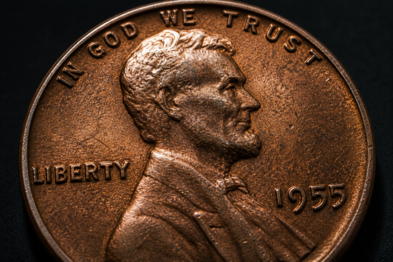
Why Two Coins With the Same Grade Can Look Completely Different
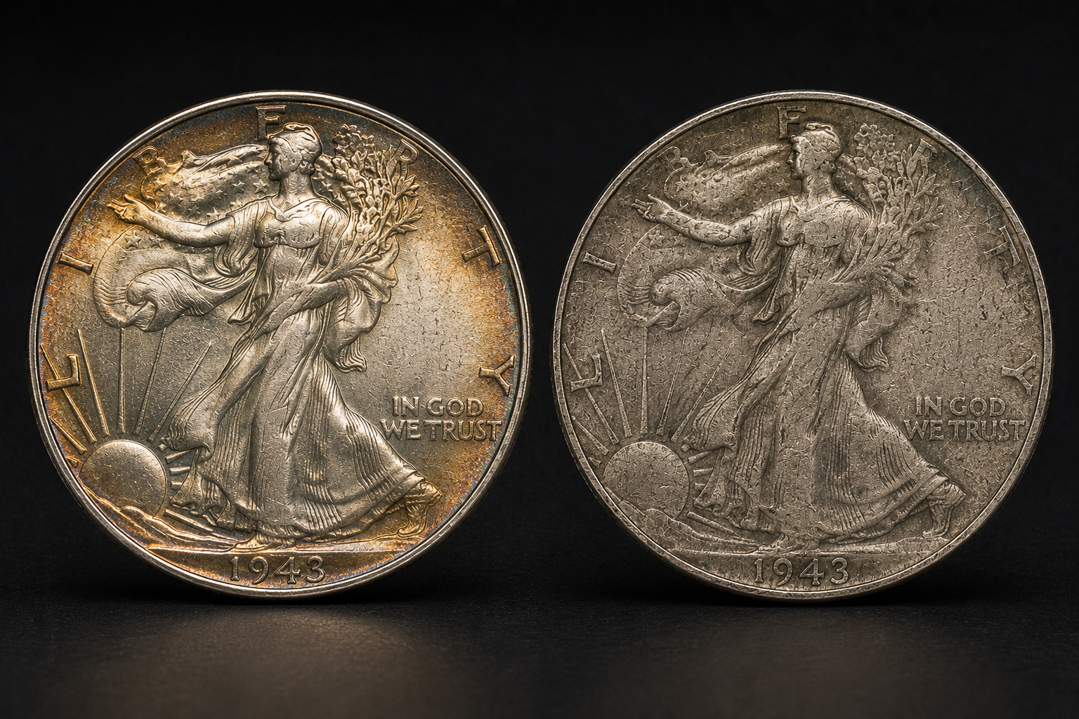
Estimated Reading Time: 17 Minutes
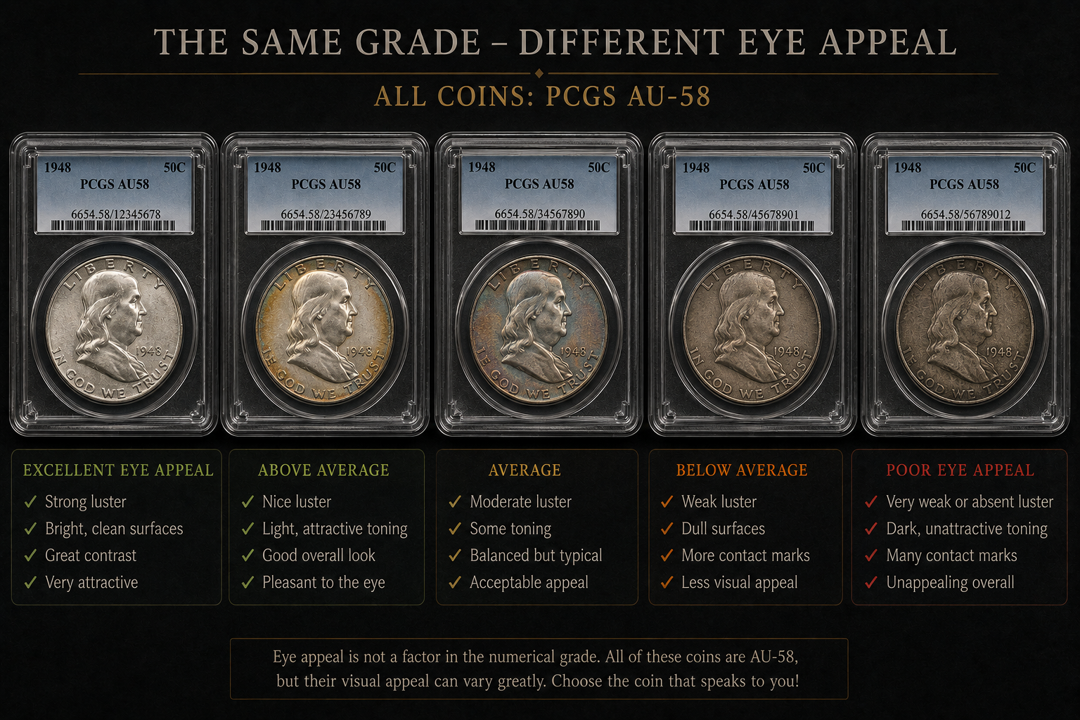
Two coins can sit side by side in identical holders, carry the same numerical grade, and still feel as if they belong to different worlds. One may look bright, balanced, and alive under the light. The other may look technically acceptable but visually tired, with duller surfaces, weaker detail, or marks placed exactly where the eye does not want to see them. To a beginner, this can feel confusing. If both coins have the same grade, why does one look so much better?
The answer is that a grade is not a photograph of a coin’s personality. It is a professional evaluation of condition within a defined range, but coins are physical objects with many visual qualities working together at the same time. Luster, strike quality, toning, contact marks, surface texture, high-point preservation, and overall eye appeal can vary widely even when the final numerical grade remains the same.
This is one of the most important lessons collectors learn after moving beyond basic grading labels. The number on the holder matters, but it is not the whole story. Experienced collectors do not stop at the grade. They read the coin itself. They compare what the label says with what the surface shows, how the light moves, where the marks appear, how strong the strike is, and whether the entire coin feels natural and balanced.
What This Article Explains
- Why two coins with the same grade can look very different.
- How eye appeal affects the way collectors judge a coin beyond the label.
- Why luster, strike quality, toning, and marks can change the entire visual impression.
- How experts compare similar graded coins before choosing one.
- Why the location of marks can matter as much as the number of marks.
- How beginners can learn to see differences inside the same grade level.
Table of Contents
- The Question That Surprises New Collectors
- A Grade Is a Range, Not a Clone Stamp
- Why Eye Appeal Changes Everything
- How Luster Can Separate Two Same-Grade Coins
- Why Strike Quality Matters Even at the Same Grade
- Why the Location of Marks Can Change the Whole Coin
- A Lincoln Cent Example
- How Toning and Color Affect Same-Grade Coins
The Question That Surprises New Collectors
At some point, nearly every collector notices the same strange situation. Two coins have the same date, same type, and same grade, but one clearly looks more attractive. The difference may not be dramatic at first, but after a few seconds it becomes hard to ignore. One coin has more life. The other feels flatter. One has cleaner focal areas. The other has marks in distracting places. One seems easier to like. The other makes you hesitate.
This moment is important because it changes how a collector thinks about grading. At first, many beginners treat the grade as the final answer. If the label says MS64, AU58, XF45, or VF30, they assume the coin has been fully explained. But the label is only a compressed summary. It cannot describe every visual relationship on the coin.
A grade may tell you where the coin sits within a broad condition category, but it does not fully tell you whether the coin has strong eye appeal, whether the luster is vibrant, whether the color is attractive, whether the strike is sharp, or whether the marks are hidden in less important areas or sitting directly on the portrait.
This is why experienced collectors continue to examine the coin even after seeing the grade. They use the grade as a starting point, not as permission to stop looking. The real question becomes: does the coin look strong for the grade, average for the grade, or weak for the grade?
That single question is one of the reasons advanced collectors often prefer one coin over another even when both share the same grade.
A Grade Is a Range, Not a Clone Stamp
One reason same-grade coins can look different is that a grade is not a clone stamp. It does not mean every coin at that level will have the exact same surfaces, the exact same luster, the exact same strike, and the exact same eye appeal. A grade represents a judgment within a range of acceptable characteristics.
Think of it like two students receiving the same score on a writing assignment. One may have stronger structure but weaker wording. Another may have better style but a few more technical mistakes. The final score might be the same, but the two papers are not identical. Coins work in a similar way. Different strengths and weaknesses can balance out into the same grade.
One coin may have beautiful luster but a few more marks. Another may have fewer marks but duller surfaces. One may be sharply struck but have uneven toning. Another may be softly struck but cleaner in the fields. The final grade may land in the same place because the overall evaluation balances several factors together.
This idea is essential for collectors who want to move beyond label collecting. The holder may provide useful information, but the coin itself still deserves careful study. The best collectors learn to understand what is happening inside the grade, not just what number appears on the label.
This connects naturally with the broader observation process explained in How to Read a Coin Step by Step. Reading a coin means studying the full object. It means looking at design, surface, light, wear, preservation, and visual balance. The grade is only one part of that reading.
Once you understand that a grade is a range, same-grade differences become less confusing. They become expected.
Why Eye Appeal Changes Everything
Eye appeal is one of the hardest coin qualities to define, but one of the easiest to feel. It is the overall visual impression a coin creates when everything comes together. Luster, color, strike, surface preservation, toning, mark placement, and balance all contribute to eye appeal.
Two coins with the same grade may have very different eye appeal because they may reach that grade through different combinations of strengths and weaknesses. One coin may be technically correct but visually dull. Another may have small imperfections but still look vibrant and balanced.
Collectors often respond strongly to eye appeal because coins are visual objects. A coin can meet the technical requirements of a grade and still fail to excite the eye. Another coin can have minor flaws but present itself beautifully because the flaws do not dominate the design.
This is why experts do not only ask, “What is the grade?” They also ask, “How does the coin look for the grade?” That second question is where eye appeal enters the conversation.
Eye appeal is also why side-by-side comparison is so valuable. As discussed in Why Experts Compare Coins Side by Side, the human eye is naturally good at detecting differences. When two same-grade coins are placed together, the stronger coin often becomes obvious very quickly.
The difference may come from brighter luster, cleaner focal areas, smoother color, sharper design detail, or simply better overall balance. The grade may be identical, but the emotional reaction is not.
How Luster Can Separate Two Same-Grade Coins
Luster is one of the most powerful reasons same-grade coins can look different. A coin with strong original luster often appears more alive, even if it shares the same grade with a coin that has weaker or more subdued surfaces.
Luster is not simply shine. It is the way light moves across the microscopic surface structure created during minting. On many uncirculated coins, this movement can create the familiar cartwheel effect. On lightly circulated coins, remaining luster can still help reveal how well the surface has been preserved.
When two coins with the same grade are viewed under the same light, one may show stronger movement, deeper glow, or more complete surface energy. The other may appear flatter, duller, or less responsive. Both may still fall within the same grade, but the first coin may feel much more attractive.
This is why lighting matters so much in coin evaluation. In How Experts Use Light to See Hidden Coin Details, we explored how light reveals surface qualities that are not always visible from a static view. The same principle becomes even more important when comparing two same-grade coins.
Light can show whether one coin has lively original surfaces while another has duller areas. It can reveal breaks in luster, patches of disturbance, or uneven reflectivity. It can also show whether a coin’s brightness is natural or whether the surface looks too flat, too harsh, or too uniform.
That is why experienced collectors often rotate coins under a light source rather than judging them from a single angle. The movement of luster tells a story. It can make two same-grade coins feel very different.
Why Strike Quality Matters Even at the Same Grade
Strike quality is another reason two coins with the same grade can appear different. A strong strike gives the design sharper detail, clearer relief, and a more complete visual presence. A weaker strike can make the coin look softer, even when the surfaces are well preserved.
This can be confusing for beginners because weak detail is often mistaken for wear. However, strike weakness is not the same as circulation wear. A coin can leave the mint with soft detail because of die condition, striking pressure, metal flow, or design characteristics. That weakness may remain part of the coin forever, even if the coin never sees heavy circulation.
This distinction matters when comparing same-grade coins. One coin may be strongly struck with bold details and complete design elements. Another may be softer in the central areas or high points. If the overall preservation balances out similarly, both coins may receive the same grade, but the sharply struck coin may look more impressive.
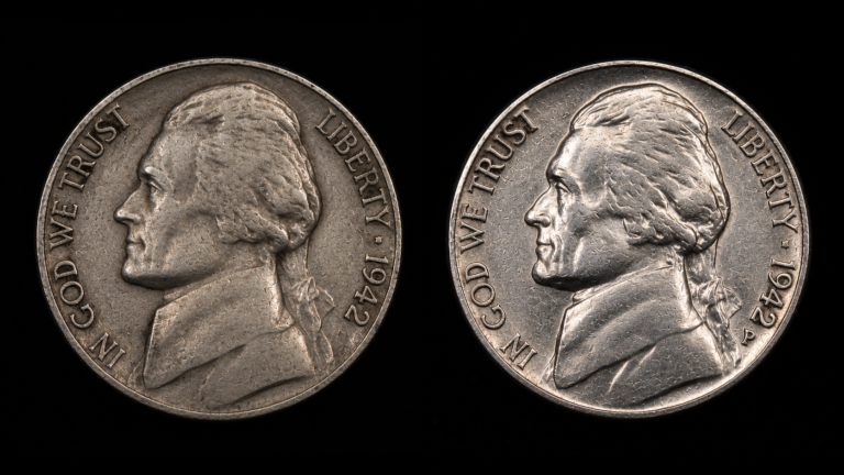
The issue becomes especially important on coin designs where collectors value specific details. Full steps on Jefferson nickels, strong hair detail on Lincoln cents, clear feather detail on eagles, and sharp building lines can all affect how a coin is perceived. Even when the grade is the same, stronger design detail can create a more satisfying appearance.
This connects with the lesson from Why Experts Always Start With the High Points. High points are crucial because they reveal wear, but they can also reveal strike differences. Experts examine them carefully because weak high-point detail does not always mean the same thing from coin to coin.
A coin with slightly weaker strike may still be technically solid for the grade, but next to a sharper example, the difference can become impossible to ignore.
Why the Location of Marks Can Change the Whole Coin
Contact marks are part of coin collecting reality, especially on coins that were stored in bags, handled in groups, or passed through commerce. But the number of marks is not the only thing that matters. Location can be just as important.
Two same-grade coins may have a similar amount of surface disturbance, yet one looks cleaner because its marks are hidden in less distracting areas. The other may have fewer marks overall but one or two located directly on the face, cheek, open field, or another focal point. The eye notices those marks immediately.
This is why experts pay close attention to focal areas. A mark on a less important part of the design may not affect eye appeal as strongly as a similar mark in the center of attention. A scratch near the rim may be less distracting than a mark across a portrait. A small hit in a busy design area may be easier to overlook than the same hit in a smooth open field.
The grade may account for marks, but the visual experience of those marks can differ from coin to coin. This is another reason the same grade does not guarantee the same appearance.
Experienced collectors often study the coin in the same sequence described in The First Thing Experts Look at on Any Coin. They notice the overall impression first, then move toward the areas that naturally attract attention. If distracting marks dominate those areas, the coin may feel weaker even if the grade is technically correct.
In other words, marks are not only counted. They are read.
A Lincoln Cent Example
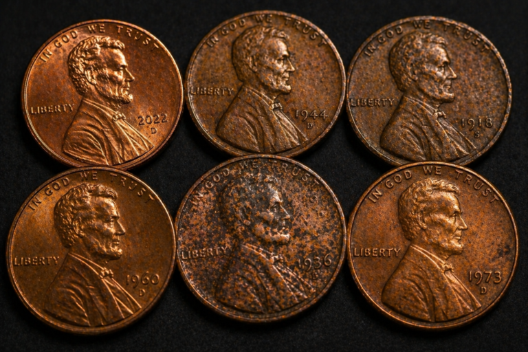
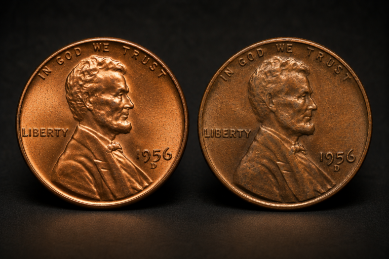
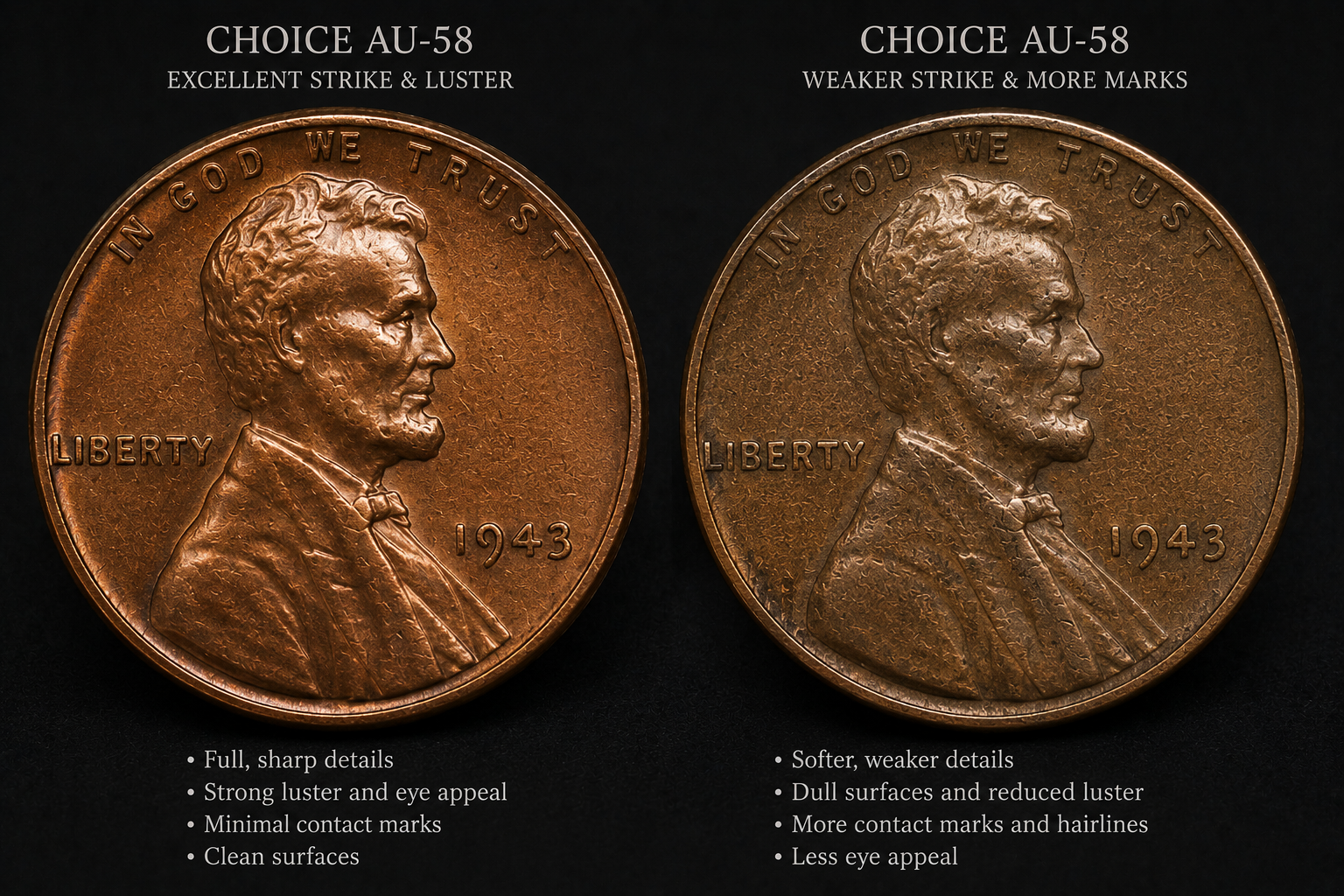
Lincoln cents offer a simple way to understand how two same-grade coins can look different. Imagine two certified Lincoln cents with identical numerical grades. At first, the labels suggest they should be equal. But once the coins are examined carefully, differences begin to appear.
One cent may show stronger detail in Lincoln’s hair, cheek, jawline, and coat. Its surface may respond more naturally to light. The fields may look cleaner, and the color may feel more even. The other cent may still deserve the same grade, but it might have a softer strike, more noticeable contact marks, or a less lively surface.
Viewed separately, each coin may seem acceptable. Viewed together, the stronger example becomes easier to identify. This is why experts compare coins under the same lighting, at the same angle, and with attention to the same design areas.
The grade tells you both coins occupy a similar condition level. The comparison tells you which one has the stronger visual presence.
How Toning and Color Affect Same-Grade Coins
Color can change the entire personality of a coin. Two coins with the same grade may feel completely different because one has even, natural, attractive toning while the other has dull, uneven, or distracting color.
Toning itself is not automatically good or bad. Some toning can enhance a coin’s appearance by adding warmth, depth, or visual character. Other toning can make the surface appear lifeless, stained, or uneven. The key is whether the color feels natural, balanced, and supportive of the coin’s overall appearance.
This is why experts avoid judging color in isolation. They ask how the color interacts with luster, surface preservation, strike quality, and marks. A beautifully toned coin with strong underlying luster may look exceptional. A coin with flat color and weak surface movement may look less appealing even if the technical grade is the same.
Color can also influence first impressions. A coin with warm copper color, attractive silver toning, or balanced golden highlights may draw the eye more strongly than a coin with patchy or dull surfaces. Even when both coins remain within the same grade, collectors may strongly prefer one over the other.
This connects closely with How Tiny Surface Changes Reveal a Coin’s History, because color is often part of a coin’s surface story. Storage, handling, environment, and time can all influence how a coin looks. Two coins may share the same grade but carry very different histories on their surfaces.
In Part 2, we will look at how surface preservation, edge details, grading balance, and collector preference explain why one same-grade coin can command more attention than another.
Surface Preservation Is More Than the Number of Marks
Many beginning collectors assume that surface preservation can be measured simply by counting marks. The logic seems straightforward. Fewer marks should mean a better-looking coin. In practice, experienced collectors know that the story is much more complicated.
The eye does not evaluate every mark equally. It reacts to balance, texture, depth, placement, and the way light interacts with those marks. A coin covered with tiny, shallow marks hidden within busy design elements may actually appear more attractive than another coin with only a handful of marks placed directly on the portrait or open fields.
This is why professionals spend time studying the entire surface instead of focusing on one isolated imperfection. They look for harmony. They ask whether the surface feels original, whether the marks interrupt the design, and whether the overall appearance remains pleasing despite normal contact from circulation or storage.
Surface preservation also includes countless microscopic details that many collectors overlook. Tiny abrasions, faint hairlines, subtle disturbances in the metal, and slight interruptions in texture all contribute to the final visual impression.
This is exactly why we previously explored How Tiny Surface Changes Reveal a Coin’s History. Small surface changes rarely tell the whole story by themselves, but together they create the personality of a coin.
Why Balance Often Matters More Than Perfection
Collectors sometimes search for a “perfect” coin within a particular grade, but perfection is rarely what experts are actually evaluating. Instead, they look for balance.
A balanced coin presents itself naturally. The luster supports the strike. The strike complements the surfaces. The toning does not overpower the design. Contact marks remain relatively unobtrusive. No single feature dominates the viewer’s attention for the wrong reason.
Now imagine another coin carrying exactly the same grade. Its strike is slightly weaker. A noticeable mark sits on the portrait. The luster appears less energetic. None of these characteristics individually pushes the coin into a lower grade, but together they create a noticeably different visual experience.
Both coins remain technically correct within their assigned grade. One simply achieves better visual balance than the other.
This concept explains why advanced collectors sometimes pay a premium for one certified coin while passing over another with the same label.
How Experts Build an Opinion Beyond the Holder
Certification has transformed coin collecting by providing consistent grading standards and greater confidence for buyers and sellers. However, experienced collectors understand that certification is the beginning of evaluation rather than the end.
When an expert picks up a certified coin, the grade is acknowledged immediately, but the examination continues. The collector studies how light travels across the surfaces, how sharply the design was struck, whether the high points retain their original texture, how evenly the toning has developed, and whether the contact marks distract from the overall appearance.
Each observation adds another layer to the final opinion.
This approach mirrors the complete examination process discussed throughout this educational series. Reading a coin involves far more than identifying a number on a holder. It requires understanding how multiple characteristics interact with one another.
In many situations, two collectors may agree completely with the assigned grade while preferring different coins because each values certain visual qualities more highly.
Why Side-by-Side Comparison Becomes Even More Important
The easiest way to understand differences between same-grade coins is to compare them directly.
This is one reason dealers often place several certified examples of the same date side by side at shows. Collectors immediately begin moving their attention from one coin to another, studying how each surface responds under identical lighting.
One coin may display stronger cartwheel luster. Another may have cleaner open fields. A third may show richer natural color. A fourth may have the sharpest strike.
None of these differences automatically changes the grade.
They simply change the way the coin looks.
This practical exercise reinforces the ideas discussed in Why Experts Compare Coins Side by Side. Human vision naturally detects contrast more effectively than absolute measurements. Comparison allows subtle strengths and weaknesses to become much easier to recognize.
After enough comparisons, collectors begin building a visual memory. They learn what exceptional eye appeal looks like for a particular grade. They also become better at recognizing coins that appear technically correct but visually average.
Can Two Collectors Prefer Different Coins?
Absolutely.
Coin collecting contains both objective and subjective elements. The grading standards attempt to measure technical condition consistently, but eye appeal involves personal preference as well.
Some collectors strongly prefer brilliant original surfaces. Others enjoy naturally toned coins. Some value exceptionally sharp strikes. Others prioritize clean fields with minimal distractions.
As long as those preferences remain within accepted grading standards, different collectors may honestly choose different coins while agreeing completely with the assigned grade.
This diversity of opinion is one of the reasons coin collecting remains fascinating. It combines measurable standards with individual appreciation.
Learning to understand your own preferences is part of becoming a more experienced collector.
Training Your Eye to See Beyond the Grade
If you want to develop this skill, start with a simple exercise.
Gather several certified coins of the same denomination and similar grade. Examine them under identical lighting. Ignore the holders for a moment and simply ask yourself which coin attracts your attention first.
Then ask why.
Is the luster stronger? Are the high points better preserved? Does the strike appear sharper? Are the marks less distracting? Does the color appear more natural?
Only after answering those questions should you look back at the labels.
This exercise trains your eye to evaluate the coin itself rather than relying entirely on the assigned grade.
Over time, you will begin recognizing the subtle differences that experienced collectors notice almost automatically.
That ability does not develop overnight. It comes from repeated observation, careful comparison, and an understanding that every coin tells its story through many small details working together.
| Factor | Coin A (Same Grade) | Coin B (Same Grade) | Why It Matters |
|---|---|---|---|
| Luster | Strong cartwheel effect | Slightly muted | Creates stronger visual energy |
| Strike Quality | Sharp design details | Softer strike | Design appears more complete |
| Contact Marks | Few marks in focal areas | More noticeable portrait marks | Changes first impression |
| Toning | Even natural color | Uneven appearance | Influences eye appeal |
| Surface Preservation | Cleaner fields | More visible abrasions | Affects overall balance |
| Overall Eye Appeal | Excellent | Average | Collectors often prefer one despite the same grade |
Reality Check
A numerical grade summarizes condition, but it does not fully describe beauty. Two coins with identical grades can leave completely different impressions because collectors respond to the combined effect of luster, strike, surfaces, toning, and overall balance. Learning to see those differences is one of the biggest steps toward thinking like an experienced numismatist.
“The grade tells you where a coin belongs. Eye appeal often tells you which one you will remember.”
Final Verdict
Two coins carrying the same numerical grade are never guaranteed to look the same. The grade reflects an overall technical evaluation, but every coin reaches that grade through its own combination of strengths and weaknesses. Luster, strike quality, surface preservation, toning, contact mark placement, and visual balance all shape the final appearance. Experienced collectors understand this, which is why they continue examining the coin long after reading the label. The more you learn to evaluate these subtle characteristics, the more confidently you will choose the strongest example within any grade.
Frequently Asked Questions
Why can two coins with the same grade look different?
Because grading measures overall condition within a range. Luster, strike quality, toning, contact marks, and eye appeal can vary while still fitting the same numerical grade.
Does stronger eye appeal mean a higher grade?
Not necessarily. A coin may have exceptional eye appeal without receiving a higher grade. Eye appeal influences collector preference but does not automatically change the assigned technical grade.
Should I always buy the coin with the better eye appeal?
If two coins have the same grade and similar price, many experienced collectors prefer the example with stronger eye appeal because it is often more enjoyable to own and may attract greater interest from future buyers.