What Makes One Coin Instantly Stand Out to Experts
Estimated Reading Time: 9 minutes
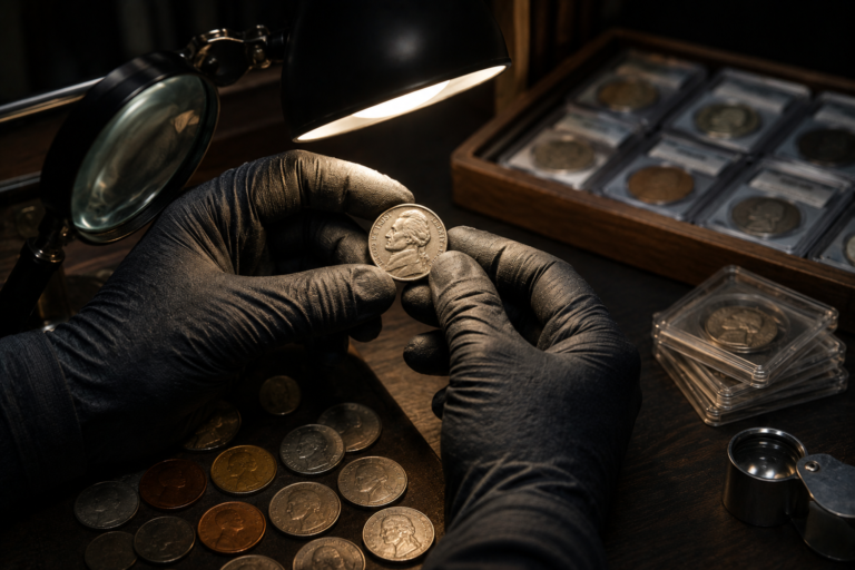
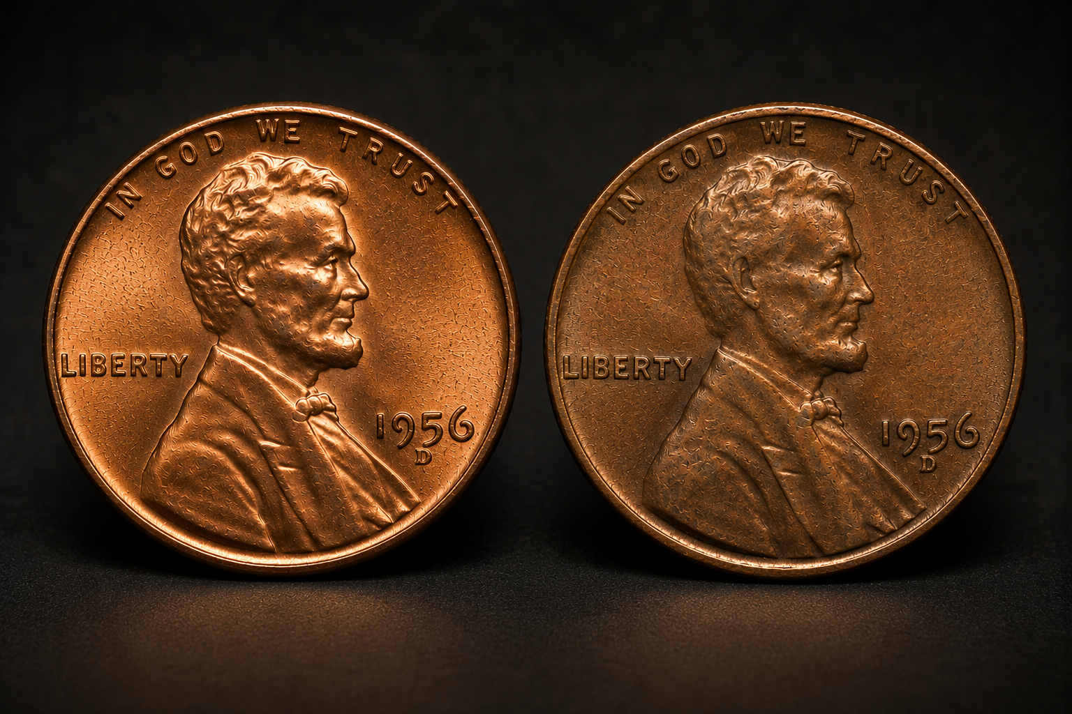
Place two coins of the same type, date, and similar grade next to each other and something interesting can happen. Before you study every scratch or compare every strand of hair in the design, one coin may already look stronger. It seems more alive under the light, its important areas appear cleaner, and the entire design feels sharper and more balanced.
Experienced collectors often recognize this difference quickly. It is not because they have discovered one secret feature that beginners cannot see. Instead, years of examining coins teach them to process several characteristics together: luster, strike, surface preservation, marks, color, and overall eye appeal. The stronger coin often reveals itself through the way these characteristics work together.
But an important distinction must be made immediately. The coin that stands out visually is not automatically the coin with the higher numerical grade. First impressions are useful, but grading requires closer examination. What experts develop is the ability to recognize quality quickly and then investigate exactly what created that impression.
What This Article Explains
- Why experts form a whole-coin impression before studying tiny details.
- How natural luster can make one coin immediately look stronger.
- Why clean focal areas often matter more than the total number of marks.
- How strike quality influences visual sharpness.
- Why original surfaces tend to create a more coherent appearance.
- How color contributes to eye appeal without replacing surface quality.
- Why the coin that looks best does not necessarily have the highest grade.
Table of Contents
- Experts See the Whole Coin First
- Luster Creates Immediate Visual Life
- Clean Focal Areas Make a Huge Difference
- Strike Can Make One Coin Look Sharper
- Original Surfaces Create Consistency
- Experts Notice the Distribution of Marks
- Color Supports the Coin, It Does Not Rescue It
- Technical Quality and Eye Appeal Are Not Identical
- What Experts Notice in the First Few Seconds
Experts See the Whole Coin First
A beginner often examines a coin by searching for individual problems. Is there a scratch? Is the date sharp? Is there wear on the portrait? Is that dark area damage? This approach can reveal useful information, but it can also cause one small feature to dominate the evaluation.
Experienced collectors tend to begin more broadly. They look at the entire obverse or reverse and allow the coin to create an overall visual impression before concentrating on individual defects.
This first impression is not a final grade. It is closer to visual triage. Does the coin look vibrant or dull? Are the surfaces unusually clean? Does one mark immediately pull the eye away from the design? Does the strike appear strong? Does anything about the surface seem inconsistent?
That is the same principle behind how experts form a rapid first impression. Speed comes from recognizing patterns, not from skipping the detailed examination that follows.
Luster Creates Immediate Visual Life
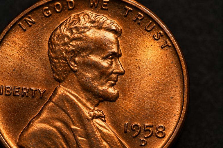
On an uncirculated coin, strong original mint luster can be one of the first characteristics to attract an experienced eye. As the coin rotates under directional light, reflections move across the surface. On many Mint State circulation strikes, this produces the familiar cartwheel effect.
A coin with vibrant, relatively continuous luster can appear visually energetic. Another coin with similar design detail but weaker or disturbed luster may look flatter by comparison.
Brightness alone is not enough. A polished or improperly cleaned coin can be extremely bright while lacking normal mint luster. Experts therefore watch the behavior of the reflection rather than simply asking which coin shines more.
This is why experts look at luster before color. Attractive color may immediately catch attention, but the way the underlying surface interacts with light can reveal much more about preservation.
Clean Focal Areas Make a Huge Difference
Two coins can contain roughly the same number of contact marks yet create very different impressions.
The reason is location.
Human vision naturally concentrates on certain areas of a design. On a portrait coin, the face is often a major focal area. Broad open fields can also make imperfections easier to notice because there is little surrounding detail to hide them.
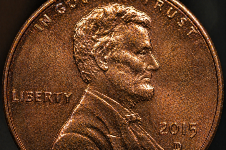
A noticeable contact mark on Lincoln’s cheek may therefore influence the appearance of a Lincoln cent more strongly than several minor marks near the rim or within visually busy areas.
When the important focal areas are relatively clean, the entire coin can appear better preserved even though careful magnification reveals small imperfections elsewhere.
This is why mark location matters more than simply counting marks. Experts are judging visual impact, severity, and placement together.
Strike Can Make One Coin Look Sharper
Strike quality can also make one example stand out when similar coins are compared.
A well-struck coin may show stronger definition in important design elements, producing a crisp and satisfying appearance. Another coin struck from the same basic design may have softer detail in areas where the metal did not fully fill the die recesses.
The crucial point is that weak strike and wear are not the same thing.
A weakly struck coin can leave the mint with incomplete detail even though it has never circulated. Wear develops later through friction and removes or alters surface detail, usually beginning at exposed areas.
Experts therefore do not simply reward the coin with the sharpest-looking design without asking why the difference exists. They consider the characteristics of the specific coin type and examine the surfaces surrounding the weak detail.
Looking carefully at why experts examine important high points helps separate true surface friction from other reasons a design may appear soft.
Original Surfaces Create Consistency
One of the harder qualities to describe is the visual coherence of a well-preserved original surface.
The luster, texture, color, and small marks tend to make sense together. Nothing immediately appears unnaturally bright, strangely smooth, or inconsistent with the surrounding metal.
By contrast, harsh cleaning or polishing can change that relationship. A coin may become brighter while losing the natural surface characteristics experienced collectors expect to see. Fine hairlines, altered texture, or disturbed reflection patterns may become visible when the coin is rotated.
This is why original surfaces matter more than artificial brightness. Shine can be created or exaggerated. Original surface character cannot simply be restored once it has been mechanically disturbed.
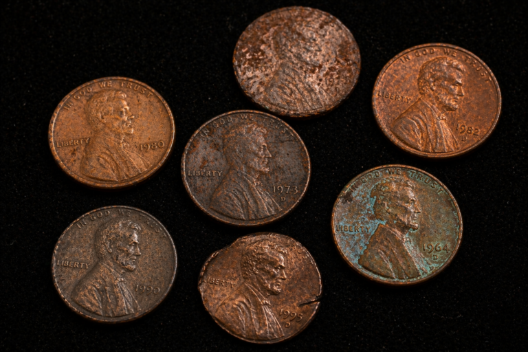
That does not mean every original coin must look perfect. Original coins can be dark, toned, spotted, marked, or worn. Originality describes what has happened to the surface, not whether the coin is beautiful.
Experts Notice the Distribution of Marks
Contact marks are normal on many coins, including coins that never circulated. What often separates a visually stronger example is not the complete absence of marks but how those marks are distributed.
Several tiny marks scattered around secondary areas may have limited visual impact. A concentrated group of marks across a portrait or open field can be far more distracting.
Severity matters too. A single deep hit can attract more attention than numerous microscopic ticks.
This is why experienced collectors rarely evaluate surfaces by simply counting imperfections. They look for patterns: where the marks are, how deep they are, how strongly they interrupt the luster, and whether the eye repeatedly returns to them.
The strongest-looking coin is often the example whose imperfections do not dominate its important visual areas.
Color Supports the Coin, It Does Not Rescue It
Color can contribute enormously to eye appeal. Warm original copper, attractive silver toning, or subtle multicolored toning can make a coin memorable.
But attractive color does not automatically erase weaknesses underneath it.
A beautifully toned coin can still have distracting marks, weak luster, altered surfaces, or poor strike quality. Likewise, a coin with relatively ordinary color can possess exceptional luster and remarkably clean surfaces.
Experts therefore consider color as part of the complete visual presentation rather than allowing it to replace surface evaluation.
This becomes particularly important with photographs, where lighting and white balance can change color dramatically. As discussed in why the first impression should be confirmed from multiple viewing angles, an attractive static image does not always reproduce exactly what the coin looks like in hand.
Technical Quality and Eye Appeal Are Not Identical
Eye appeal is where many of these characteristics come together.
It describes the overall visual impression produced by factors such as luster, strike, marks, color, toning, and surface preservation. It is partly subjective, but that does not make it meaningless. Experienced collectors often agree that certain combinations of characteristics are unusually attractive or unusually distracting.
Two coins can therefore receive the same numerical grade and still have noticeably different eye appeal.
One might have stronger luster but a slightly weaker strike. Another might have cleaner fields but less attractive toning. A third might technically qualify for the same grade while carrying a prominent mark that makes it less desirable to a particular collector.
This explains why coins with identical grades can still look dramatically different.
It also explains why the coin that instantly stands out does not automatically deserve the higher grade. Grading and visual preference overlap, but they are not identical concepts.
What Experts Notice in the First Few Seconds
You can practice the same examination sequence without trying to assign a grade immediately.
Start with the whole coin. Hold it at a normal viewing distance and notice your first impression without searching for a specific flaw.
Next, rotate it under a stable directional light. Watch the luster and look for interruptions in the reflective pattern.
Then examine the major focal areas. Notice whether marks are scattered harmlessly or concentrated where the eye naturally looks.
Move to the strike. Compare important design details with other examples of the same type rather than assuming every soft feature represents wear.
After that, study the surfaces more closely. Look for hairlines, unusual texture, discoloration, corrosion, or evidence of alteration. Consider color only in the context of everything underneath it.
Finally, return to the whole coin.
This last step matters. After examining every imperfection individually, ask whether those imperfections actually dominate the coin when viewed normally. Experts constantly move between close inspection and the overall visual impression.
| Feature | Coin That Often Stands Out | More Ordinary Example |
|---|---|---|
| Luster | Strong, lively, and relatively continuous | Weaker, flatter, or more interrupted |
| Focal Areas | Relatively clean and visually calm | Distracting marks in prominent locations |
| Strike | Strong definition for the issue | Softer important details |
| Surfaces | Natural and visually coherent | More disturbed or inconsistent |
| Marks | Minor or favorably distributed | Concentrated in important focal areas |
| Color | Complements the underlying surface | Neutral or visually distracting |
| Eye Appeal | Major characteristics work together | One or more weaknesses dominate attention |
Reality Check
A coin that immediately looks better is not automatically the higher-graded coin. Strike characteristics vary by issue, toning preferences can be subjective, and technical grading considers more than visual attractiveness alone. The expert advantage is not simply choosing the prettiest coin. It is recognizing what created the visual difference and then determining whether that difference is actually relevant to grade, originality, or desirability.
“The best-looking coin rarely wins because of one perfect feature. It stands out because the important features work together.”
Final Verdict
One coin can stand out to an expert within seconds because experienced eyes process the entire surface before becoming trapped by individual details. Strong natural luster, clean focal areas, an effective strike, original-looking surfaces, favorably distributed marks, and attractive color can combine to create exceptional eye appeal. No single characteristic guarantees superiority, and the most attractive coin is not automatically the highest graded. The real skill is learning to recognize when the important characteristics reinforce one another. Once you begin seeing the whole coin instead of hunting for one perfect feature, the differences between ordinary and exceptional examples become much easier to understand.
Frequently Asked Questions
What makes a coin have strong eye appeal?
Strong eye appeal usually results from several characteristics working together, including attractive luster, pleasing color, good strike quality, relatively clean focal areas, and surfaces without distracting problems. The exact balance varies by coin type and by individual collector preference.
Can two coins with the same grade have very different quality?
Yes. A numerical grade represents a range of acceptable characteristics, not a guarantee that every coin in that grade will look identical. Two coins with the same grade can differ in luster, strike, mark placement, toning, and overall eye appeal.
Does the coin that looks best always have the higher grade?
No. A visually attractive coin may have exceptional color or eye appeal while another coin qualifies for a higher technical grade for other reasons. Appearance, technical grading, and collector preference overlap, but they should not be treated as exactly the same thing.